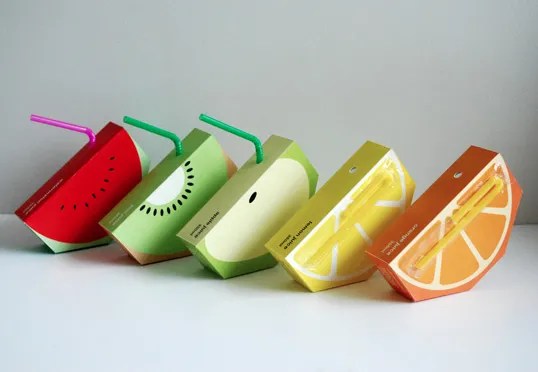
Designed by Yunyeen Yong | Country: Australia
“Jooze is a fictional company that manufactures fresh fruit juices, catered especially to kindergarten and primary school students. It is a company that believes that healthy eating habits should begin at a very young age.
The shape of the logo is inspired by the shape of a sliced fruit, and the handwritten typeface used is to portray a sense of fun, hands-on personality and characteristic that appeals to kids and toddlers. The logo also consists of singular bright colours, which may vary depending on the flavour of the juice. This would hopefully be a recognisable icon whereby children can relate and connect to the brand.
A simplified illustration of the fruits are to further clarify the flavours, to add visual aesthetics, and to appeal and connect to the target audience.
The juice box is shaped in an unconventional way to incorporate the essence of the logo, to gain instant recognition from the audience, and to capture their attention, especially if this product is placed alongside other juices on the supermarket shelves.”


Wayyy too cute and clever, I want to make some! Great post.
I know! Wish they had those when I was little!
innovative!
Nahhh! You’re never too old for good nutrition, Megan. Dive on in, and drink away. 🙂
True story! Thanks!
Healthy eating is of course very necessary specially if you want to live longer and avoid future ailments. “:“*
Our personal internet site
http://www.foodsupplementdigest.com/is-melatonin-safe-for-kids/